How do I use stickers and colors in PlanJour without my calendar looking chaotic?
By PlanJour team, Sparklithic Ltd · Published · Updated
Personalization is meant to make your calendar easier to read at a glance, not harder. Here's how to use stickers and colors with restraint.
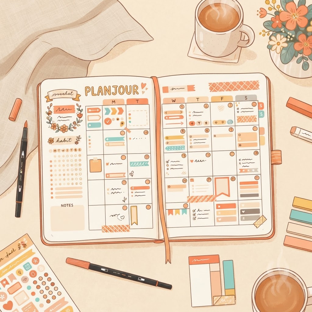
Stickers and colors are meant to make a calendar faster to scan, but overused, they can have the opposite effect: a week view so busy with different colors and icons that nothing actually stands out. Here's how to get the benefit without the clutter.
Pick a small, fixed set of categories first
Before assigning colors to individual events, decide on a short list of categories, work, personal, health, social is plenty for most people, and give each one a consistent color across your entire calendar. Assigning colors event-by-event, without a fixed system, is exactly what leads to a rainbow of colors that don't actually mean anything at a glance.
Use stickers for meaning, not decoration
A sticker is most useful when it tells you something a color alone can't, a specific recurring habit, a particular type of appointment, rather than just being decorative. If every event gets a different sticker regardless of what it is, they stop functioning as visual shorthand and just add noise.
Reserve bright or bold colors for what actually needs attention
If everything on your calendar is a bright, saturated color, nothing reads as more urgent or important than anything else. Keeping routine, low-stakes events in muted tones and reserving a bright color for things that genuinely need to stand out (a deadline, a rare event) makes the one thing that matters actually visible at a glance.
Fewer categories age better than more
It's tempting to create a new category the moment a new kind of event shows up, but categories tend to accumulate over time if you're not careful, ending with ten colors that are hard to distinguish and harder to remember the meaning of. Revisiting your categories every few months and merging ones that have become redundant keeps the system legible long-term.
Test it with a squint
A genuinely useful check: look at a full week view from a slight distance, or squint at it, and ask whether you can tell what kind of day it is without reading a single label. If the answer is yes, the color system is doing its job. If it just looks like noise, it's worth simplifying rather than adding more distinctions.
The goal of personalization isn't maximum decoration, it's making your own calendar readable to you faster than a plain grid would be. A calendar that takes longer to parse because of its colors and stickers has gone past the point where personalization is actually helping.